MONOCHROME BEDROOM TREND WITH A POP OF COLOUR

Thursday 19 June 2014

If your looking to add a modern and timeless touch to your bedroom why not try the smart monochrome theme with a pop of colour. It's a great way to modernise your bedroom without it ever going out of style , if you ever wanted a change a simple change of accessories would do the job just fine. I have put together a scheme as I am in the process of re-designing a few bedrooms and decided to share some of them to give you a bit of inspiration. 

This particular scheme is quiet strong as the colours are quiet moody and dark however by the simple use of a pop of colour as well as mirrored furniture it will instantly give the room a bigger and brighter look. The strong , striking and quiet graphic interior will for sure make an impact , monochrome is such a classic look which is taking over not only in the interior design industry but fashion world too. This iconic colour combination is one that will always look fresh. 

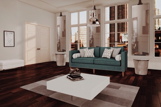
BEDROOM FURNITURE SCHEME 


As this trend is minimalistic in colours it is important to mix textures and materials. Another great way to spicing up the black and white look is by combining a mixture of patterns like seen in the scheme above, although colours were kept quiet similar there is various patterns and prints I introduced to keep it looking interesting and vibrant.

The gorgeous black , clean lined Bed I found in the Ethan Allen store was this bed inspired me to keep it all monochrome , the bold design is classic and looks great with the rest of the scheme. Whilst the Bedside Tables are still within the sleek and clean lined shape I was drawn to them by their mirrored circular detail , it adds almost a more feminine look to the room in my opinion. To add a bit more feminism but also extra seating area an Ottoman has been placed in front of the bed which personally I love the look off.

Lamps are a great way to add that little bit of colour to the room , I opted for this contemporary aqua Lamp which looks great with the cushions I chose to put on the bed the first  Cushion Silver Glitter and the Cushion Aqua Chevron compliment each other well whilst adding a bit of drama to the room.

Wall art is a fab way to add some colour to the walls without having to paint it or wallpaper it since there is a lot going on already I opted for this option in this bedroom the simple yet impact making  Painting adds that extra something without being over powering to the rest of the scheme.

Between the two windows I put a small mirrored  Console with an Octagon Mirror above it and a Vase this  gives an illusion of a bigger space but also brightens up the whole scheme.

I chose a wardrobe which had see through doors as this once again makes the space feel more open and free. This  ChairI fell in love with when I saw it, it is also a more feminine piece which makes a big visual impact on that side of the room. In fact if your note familiar with the Luxe Deco store online I suggest you go and have a little look as they have beautiful furniture pieces.

Flooring wise I wanted to keep it clean and fresh hence the white wooden flooring with this gorgeous multi toned Rug which completes the look.

BEDROOM FLOOR PLAN DRAWN UP TO SCALE


SHOP THE LOOK 


LONDON APARTMENT SCHEME DESIGN

Monday 2 June 2014

I recently attended an interview for a luxury interior design showroom based in London where I was invited for the second stage of the interview which involved a little design work. The brief was to produce a design scheme showcasing all of your interior deign skills.

THE BRIEF:

The brief was a property in London and is a first floor flat, the clients also have a cottage in Bath The couple are in there early 40's and have no children. They love to entertain with friends usually just 2 at only one time and need to offer occasional overnight accommodation. They both love to read and cook.

MY APPROACH ON THE BRIEF: 

My approach on this design brief was to create a space that creates a home atmosphere with a modern twist, what I mean by that is I wanted the space to be practical and fit the clients needs, yet still have a youthful and oh so called designed feel.

As the clients are regular entertainers with a passion for cooking this often goes hand in hand with each other , I created an open plan space and combined the kitchen with the dinning and lounge area. Since it is an apartment meaning the space Is limited I felt this was the most effective approach as it creates unity between all spaces in that particular area of the apartment.

Each area is still separate however instead of separating it with walls I did so by the use of furniture.  

ORIGINAL FLOOR PLAN


FLOOR PLAN PROPOSED BY ME


 PROPOSED SCHEME FOR THE KITCHEN | DINNING ROOM | LIVING SPACE

The colour palette in this room is based around light grey blues , golds , creams with a splash of black , which I added intendedly to add a bit of drama and mood in the space. The wooden feature that divides the kitchen with the rest of the space acts almost as a feature that creates that homey / cottagey feel to the space in order to make it flow and work with the rest of the scheme it was incorporated in the back wall of the lounge space.


PROPOSED SCHEME FOR THE GUEST ROOM

Both clients work in environments where they might have to do some work from home from time to time so the spare room I wanted to be multi functional. I placed a sofa bed which means in case there are guests staying over but it can also be used asa study room during the day if needed.


The style has been kept similar to the rest of the apartnebt however to create a slightly different feel I added a pop of colour by incorporating a yellow colour in to the scheme which complements the neutral greys really well. 


 SHOP THE LOOK


PROPOSED SCHEME FOR THE MASTER BEDROOM

In the master bedroom I opted to make the space feel relaxed I created a moody scheme however still using light tones so that the space feels spacious. I took a slightly different approach on the headboard due to the window it was limiting the space. I opted for a rectangular leather headboard which gives the space a modern touch to the space. To create a bit of drama I placed large rectangular windows alongside the bed side tables and put a geometric wallpaper on the opposite walls.


Due to the limited space I moved the wall slightly to create a bigger space in the storage area meaning a customised wardrobe could fit in , this works great as It doesn’t clutter the bedroom yet still gives a pretty decent sized amount of storage. 


 PROPOSED SCHEME FOR THE HALLWAY | KITCHEN


The corridor is very narrow so instead of cluttering it with furniture I placed a geometric wallpaper adding a bit of boldness to the space and placed mirrors on the walls just to make the space slightly more interesting.


New York Style Apartment Decor

Thursday 10 April 2014


A New York Style apartment is probably something a lot of us wish we had. They tend to be beautiful and have a gorgeous traditional with a twits of a modern touch feel to them similar seen to my proposed design above of course that is dependent on the individual living in one however this is just my interpretation  of what I would imagine it to look and feel like.

In my design above I stuck to a pretty minimal design with a slight masculine feel with the chrome accessories and a slight pop of color with the sofa. The colors of the decor have been kept simple but to give it a more 'designed' feel subtle patterns and texture were added i.e. in the cushions on the sofa along with the geometric carpet. The dark wooden floor livens up this room adding a bit of drama to the overall atmosphere in the room.

« »
Blog Design by The Blog Store